TullyRunners - Article
NXN Boys Regional Races 2015 - A Graphical Comparison
by Bill Meylan (August 8, 2016)
Technical Article (for viewers interested in speed ratings) ..... As usual, recent inquiries prompted this article ... In my National Pre-season Teams Projections for 2016, I noted that speed ratings indicated that the American Fork Boys and Carmel Girls looked like the top potential At-Large selections to NXN 2015 even though both teams finished fourth in their respective NXN Regional races (Link to Boys Team Projections and Girls Team Projections) ... Although a bit more than just speed ratings from the regional races goes into that indication, some viewers interested in speed ratings asked about direct comparison of the NXN Regional races and how I handle the comparison.
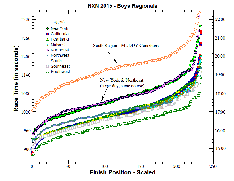
As noted in other articles on TullyRunners, I use graphical evaluation as one of several methods to determine speed ratings ... So direct graphical comparison of the NXN Regional races starts by graphing the results of all nine races on the same graph ... the graph plots finish position (x-axis) with corresponding race time (y-axis) ... Since each race has a different number of runners, the finish position number must be scaled to a common number (how it's done is noted below) ... Nine races makes the graph somewhat "busy" and a little confusing to follow, but here is the graph with a legend depicting the symbol used for each region:

Some Things to Note from the Graph:
(1) South Region ... The
South Regional was run in very muddy conditions and appears to be a
significant "outlier" compared to the other regions ... it sticks out like a
sore thumb on the graph actually![]() ... The South course ran remarkably slow due to the mud ... Speed ratings
for races like this can be calculated accurately, but their relative
significance is a matter of opinion.
... The South course ran remarkably slow due to the mud ... Speed ratings
for races like this can be calculated accurately, but their relative
significance is a matter of opinion.
(2) New York & Northeast Regions ... The New York and Northeast Regional races were run on the same day and same course (Bowdoin Park) ... As can be seen from the graph, these two races line-up nicely together indicating the relative speed of both races is effectively the same ... The Northeast line (purple symbols on the graph) shows one "anomaly" between finish positions about 30-60 (a bump where a small segment of runners ran relatively slow compared to the race overall which is not unusual) ... If somebody evaluated both races looking only at finish positions 30-60, they might conclude the Northeast race was nearly 10 seconds slower than the NY race, but a more complete evaluation shows that limited evaluation would be incorrect.
(3) Midwest & Heartland Regions ... A bit hard to see on the graph because lines are falling on top of each other, but between positions 1-130, these two regions line-up nicely indicating nearly identical speed ... I focus on the top 50-60% of finish positions because these matter most in individual rankings and team projections.
(4) California ... The California symbols are mostly hidden underneath the Midwest and Heartland Regions ... If the overall quality of the California State Meet was equal to the overall quality of the Midwest and Heartland races, their relative speeds would be nearly identical, but lots of data indicates that's not the case ... It's not just the California State Meet - Most State Meets that run separate class or division races have overall qualities somewhat lower than NXN Regional races ... California requires merging five divisions and over 900 runners ... like most State meets, a fair number of teams qualify and compete at States that are not as strong as typical NXN regional teams, and that lowers the overall relative quality of State meets ... and the merging itself can affect relative quality (some classes or divisions are likely to be slow).
The following Table lists the Race Adjustments I used to calculate the Speed Ratings for the NXN Boys Regional Races in 2015:
| NXN Region | Race Adjustment Used to Calculate the Speed Ratings | Race Speed Relative to NY |
| California | -81 seconds | 48 seconds faster than NY |
| Heartland | -72 seconds | 39 seconds faster than NY |
| Midwest | -72 seconds | 39 seconds faster than NY |
| New York | -33 seconds | same as NY |
| Northeast | -33 seconds | same as NY |
| Northwest | -51 seconds | 18 seconds faster than NY |
| South | +36 seconds | 69 seconds slower than NY |
| Southeast | -84 seconds | 51 seconds faster than NY |
| Southwest | -93 seconds | 60 seconds faster than NY |
Where Did These Race Adjustments Come From:
(1) Graphical Comparison of each NXN Region to itself from previous years ... I know the race adjustment from previous years, so graphing previous years on the same graph as the current year allows approximation of current year's relative speed based on difference from previous years ... Unless there is a major difference in the make-up or number of runners from previous years, I assume the overall quality to be the same which allows direct comparison (if a quality difference is apparent, there are methods to handle it ... but for approximation purposes it is rarely needed at NXN).
(2) Derive a separate race adjustment based on the known speed ratings of the individual runners and teams at each NXN Regional ... My seasonal database of known individual speed ratings from State Meets and other meets is used for this method ... Then - Combine the graphical race adjustment and the individual race adjustment into a single race adjustment (the individual race adjustment gets more weight if enough data are available).
(3) Check by Graphically Approximating the difference with other NXN Regional races ... the NXN Northwest race was run before the other NXN races last year, so there was nothing to compare it to until other races were run ... the later races allowed more comparisons.
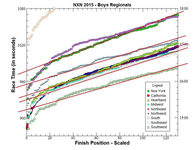
Below is an enlarged section of the graph above ... enlargement allows the individual races to be seen more clearly ... The straight red lines are drawn for comparing speed differences ... I draw these lines by "eye-balling" where I think they should go (based on experience) ... Slight differences in the races require slight differences in the slopes of the red lines ... Important: Based on my methodology, the differences are always read at Y-Axis (left-hand side) ... For example, the difference between the New York/Northeast line and the Northwest line is about 21 seconds ... the difference between the New York/Northeast line and the Midwest/Heartland line is about seconds 40 seconds ... the difference between the New York/Northeast line and the Southwest line is about seconds 64 seconds ... These are not exactly the same as the adjustments I actually used to make the speed ratings, but they are close (see table above).

Finish Position Scaling ... Most regional NXN races have between 200 to 400 runners while the merged California State Meet (used as the California regional) has over 900 runners ... Scaling means making the data for each region "fit" on exactly the same distance on the x-axis ... for example, California has by far the most runners so scaling California to "fit" any other region means compressing the California data points together.
Since I'm
from NY, I decided to use the number of runners from the New York Regional
as the common number for scaling all other regional races ... NY had 233
runners so I scaled all other races to theoretically have 233 runners ...
Sounds complicated but it is easy to do in a spreadsheet ... California had 973 runners ...
The scaling factor is calculated by simply dividing the number from NY by
the number from California or 233/973 = 0.239466 ... each finish position
from California is now multiplied by the scaling factor and that number
is used for plotting the graph (and not the actual finish position)
... Note that multiplying finish position 973 from CA by the scaling factor
(0.239466) equals 233, so the last guy in NY and the last guy in CA end up
at the same place on the x-axis ... The same is done for all regions.