Tully Runners - Article
[back to Home Page] [back to Articles Page]
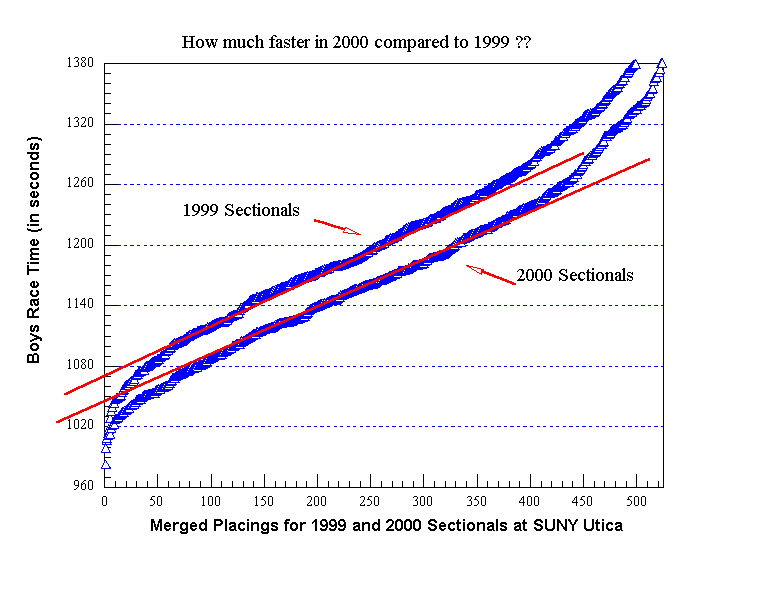
How Much Faster Was the SUNY Utica Course at the 2000 Sectionals Compared to the 1999 Sectionals??
by Bill Meylan (TullyRunners Webmaster)
(update draft: January 2001)
Several people have asked me about the fast times at the 2000 Sectional races at SUNY Utica Tech on November 4, 2000 ... I think they are wondering about all the "Meet Records". First, the fast times were being run by some very fast and excellent runners. Second, the course was faster on average in 2000 compared to 1999 (Nov 6, 1999) by approximately 20 seconds ... this is not a guess on my part, it is a mathematical comparison. This 20 second course correction is a perfect example for demonstrating part of my speed rating methodology.
When I have sufficient race results, I plot the placings versus the race times and compare it to my "base-line" course (SUNY Utica at the 1999 Sectionals) ... you don't need to know who the runners are or where the race was run; you only need to know the times and the places! The graph below illustrates the results for the Sectionals in 1999 and 2000 ... the straight red lines are simple statistical approximations drawn through the "average ability" runners ... the group of "elite" and "above average" runners (the faster runners where the plot curves) are ignored for this type of determination. The variation between the two red lines is about 20 seconds at the Y-Intercept. With the large number of data points, this 20 second difference has a very high level of certainty!
For those interested ... whenever you plot a distance race (time vs place ... XC race, road race, Olympic race with a sufficient number of runners) you will always get the same shape curve (an S-shaped curve with a relatively straight line mid-section) ... It tells you one interesting point: "elite" runner are a lot better than average runners ... average runners get better progressively ... elite runners take a big step forward and are "exponentially" better by comparison. For statisticians ... rotate the graph 90 degrees clockwise. What does the graph look like? ... that's right, a natural "probability distribution" curve! Simply plotting times vs places yields a probability distribution ... when you have sufficient data to fill in the distribution, you can compare race times of different runners at different courses with very reasonable accuracy that does not involving any guessing ... you just need to be crazy enough to spend all the time required to implement this process.